WWDC has brought a look at the new, completely redesigned iOS 7. The new look is a complete overhaul which hasn’t been done since the original iOS. Up until now there have been design improvements only; this is a big step that I think has paid off!
WWDC was a fantastic success, even before the event started with apple fans trying to guess what apple had to show us.
I watched the entire event as did many and thoroughly enjoyed it. With the announcement of the new Haswell processors in the Macbook Air, the reveal of the new Mac Pro, the reveal of OSX Mavericks and lastly the biggest part of the event, the completely redesigned iOS 7.
It has taken on a more ‘flat’ aesthetic which some would say is similar to its competitor the Android OS. This idea of making things flat is already a big deal at the moment with a lot of people taking it on, making many UI’s much simpler and easier to use.
I am a fan of this new design, it looks great! However I am not a fan of everything about it, but then this comes with a complete overhaul. Not everything is liked by everybody.
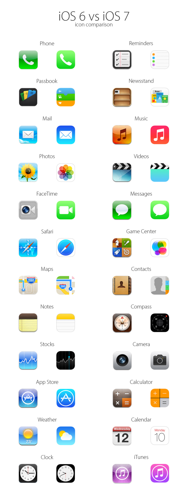
It may have similarities with the Android OS but this is what I would call an evolution not a revolution. Its nothing we having seen before, but a different take on ideas that are shared by millions of designers around the world. Below is a comparison of the icons used in iOS6 and iOS7.
Some of the new features added to iOS7 have given more chances to create a sleek interface for hundreds of tasks you may use your phone for. Some of the features that were added included,
- Control Centre – A drag up menu showing highly used functions with a translucent background which gives a simple feeling that you haven’t gone far from your home screen.
- Multi tasking – It has been upgraded to pe a proper multi tasking tool, giving large visuals of the apps you where using.
- Safari – Safari has been updated for full screen browsing and some of the interface removed/replaced to keep the feeling of simplicity. New tabs feature has been added and gesture based navigation throughout the browser.
- Keychain – This feature Is one of my favourites. keeping your passwords safe and available to you between all of your devices wether it be your Mac, iPad or iPhone.
- Airdrop – This is a really clever idea and has been well executed in the simplicity of being able to share things between devices.
The list goes on including iTunes Radio, video and photo upgrades, security features and iOS in the car which although not everybody will be able to make the most of that feature, is very clever.
I highly expect this new design will do really well and be adopted by many people with great success. This is a very small round-up of what has been seen of iOS7 so far. I have had confirmation from developers that are currently using the beta that it is great and they have had minimal issues, which is to be understood as, after all, it is a beta.