I have recently re-designed my portfolio site.
Nothing too different, just an improvement on what was there before. This is a little breakdown of the changes I have made and why.
When I had finished my last design and build I was so pleased with it, it was minimalist, clean and looked really good. I felt I had really come a long way from previous versions. Over time I felt there was something missing, I couldn’t figure out exactly what it was. I took the best course of action and left it for a while and took as much inspiration from the things I saw.
decided the site needed more to look at, although white is nice, some people would use the word ‘boring’. I didn’t go too overboard though because at the end of the day it’s the content that matters and I didn’t want anything distracting people from it.
Apart from minor tweaks such as spacing, font sizes, font weights and so on, the main changes I have made are to the header and the home page.
Header
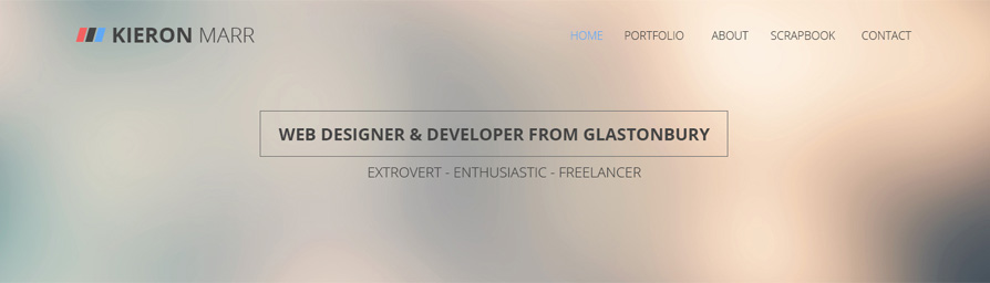
The previous header was good but thought I could use it to add a splash of colour and something that looked really good. there was also a large image for the home page that was going to be a carousel… but then I thought… I have no real need for a carousel, so I decided against it.
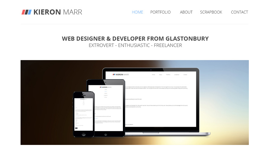
The new site has taken some inspiration from the big backgrounds you are starting to see with many different effects to brand these big images with the site. This can be something like blurred images (I have gone for this approach), a coloured overlay or a pattern to make the image not look like it’s ‘just an image’ and make it look different, stand out and something special.
Home Page
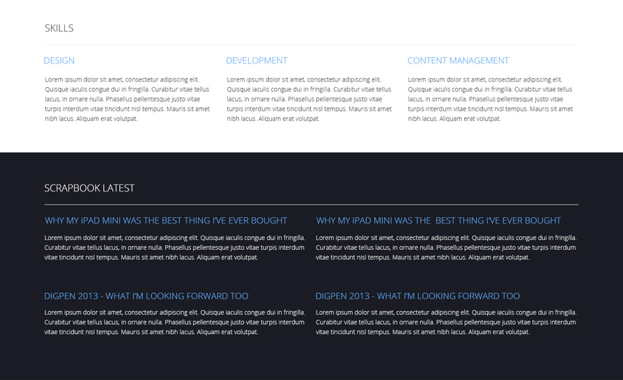
So as I mentioned above there weren’t many changes but the home page looks quite a bit different. It still has some elements of the old home page content but one main thing has been changed and that is the “latest scrapbook” section. What I had before I thought was a good idea but then could see how it may be confusing after a while the way that the posts were laid out. Also the fact that everything was white the content almost seamed to blend in with each other. I wanted a breaking point, something to differentiate areas of the home page.
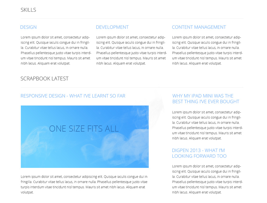
The layout has slightly changed, the featured post has been removed and just a list of the four latest have been put in place instead. the main change though is the colour. I played around with a few different colours and eventually settled with this one, I had previously used this idea in a much earlier version of my portfolio. This new layout I feel is a vast improvement and breaks the sections on the home page up.
Conclusion
In my eyes the re-design wasn’t necessary but I really thought it could be improved and needed to be improved just to show what I am capable of. I have more ideas for the future of this portfolio and I will be rolling those changes out in the near future.